Vote in the poll below. First, let’s check out the box art design itself.
North America/Europe
Castlevania II: Belmont’s Revenge’s Western design features presumably protagonist Christopher Belmont brandishing the franchise’s hallmark whip at an enemy breaking through an iron gate. The background here is particularly impressive, showing multiple architectural and natural landmarks. The logo itself is incredibly impressive – literally – Because it is surrounded by many lightning bolts. This is really nice!
Japan

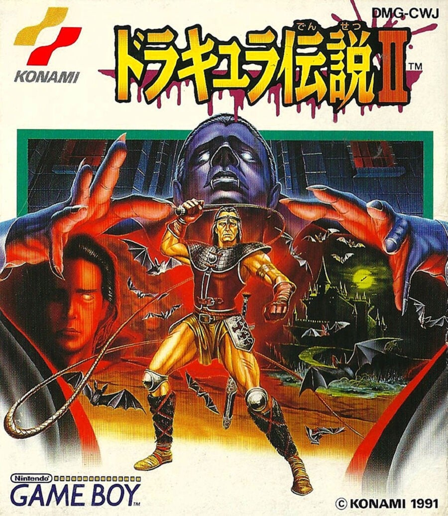
The Japanese approach, on the other hand, is very reminiscent of previous box art efforts, focusing on including multiple characters in a more abstract composition. Instead, the game’s logo and various icons are set against a white background. Oops, this will be a touch choice!
Thank you for voting! See you at the next Box Art Brawl.


